Financial Application / Debt Section Design / Product Designer
Integrating DEBT section into a MOBILE financial application for a TOP 3 US INSURANCE company
Scroll ↓

The Setup
Business
Insurance company producing a mobile application to help users better understand and improve their finances.
Challenge
The business wanted to add a Debt section within their Release V2 of the application. The challenge was the look and feel of this section, where it might live within the application, and how we wanted it to fully communicate to the user.
My Role
Design the Debt section of the financial application for users to holistically view their debts and propose a pay down strategy to guide and better their financial health.
Project Time
Four months from ideation to first initial development
-

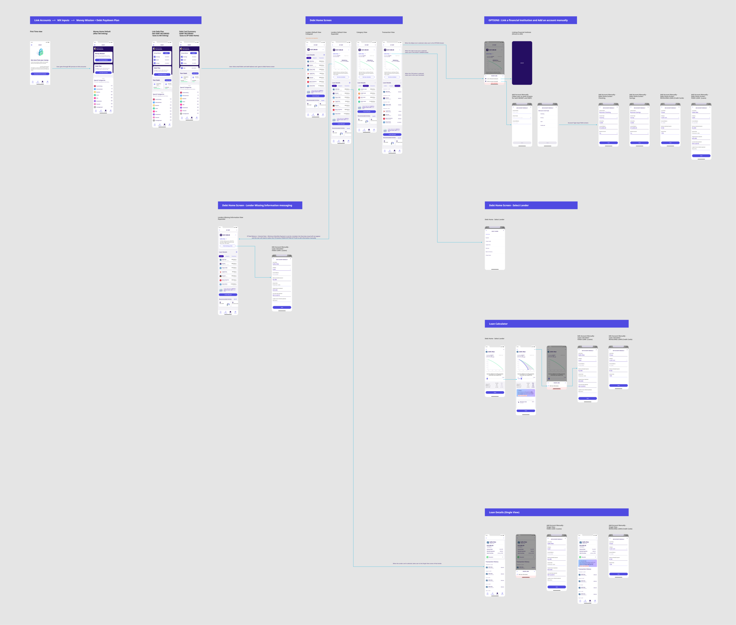
Debt Roadmap Flow
-

Debt Roadmap Details
-

Money Section Sitemap
Why “MONEY”?
Well the main experience of the application is for the user (once they link their accounts) to be able to view their earnings, spending, and savings to allocate money for specific “savings goals”: Debt would be one of those proposed goals. -

Debt Section Sitemap
The other challenge was “Where would the Debt section live”? So this Sitemap laid out the possibilities for Debt.
What you see
This is the first approach by a talented strategist (with Figma experience) on the Debt portion of the application.
I entered the project a few weeks after the Discovery phase, so they attempted to do these in mid-fidelity to help as Ii onboarded onto the project.
The beginning experience consisted of:
- Loans to include from MX api
- Edit any included loan
- Add new loan (takes you back to MX api)
- Debt Manager profile page (Debt chart, loan details, loan calculator CTA, create Debt goal, Wisdom insights card)
- Loan Calculator screens
Client Response + Rethought 1
-
The client felt there were certain elements within Debt that should have been “patterned” from the Money section and embedded into the experience.
-
The Debt section had a lot of dependencies. We had to follow the experience that Money was designing; though the team was still in their “exploration design phase” as well.
Along with this, a portion of our Design team was also revamping the current component library; extending some of the time constraints and rapport with the Dev team.
And in all, we were still trying to establish a full Debt experience within the small alloted roadmap timeframe. -
I met with the team to discuss our approach.
- what “merge” will we / should we have with Money
- should our approach be reconsidered
- can we reconsider the Debt screen’s communication to user: overview vs progression
Version 2
(Slide 1)
After meeting with the Debt team, we knew we needed to make an approach that was a little more structured. I worked on the possibility of showcasing the Debt section as a “progression guide” more so than just an overview. The app was also providing many “help options” throughout the app; making us believe it was possibly going to be too overwhelming for the user.
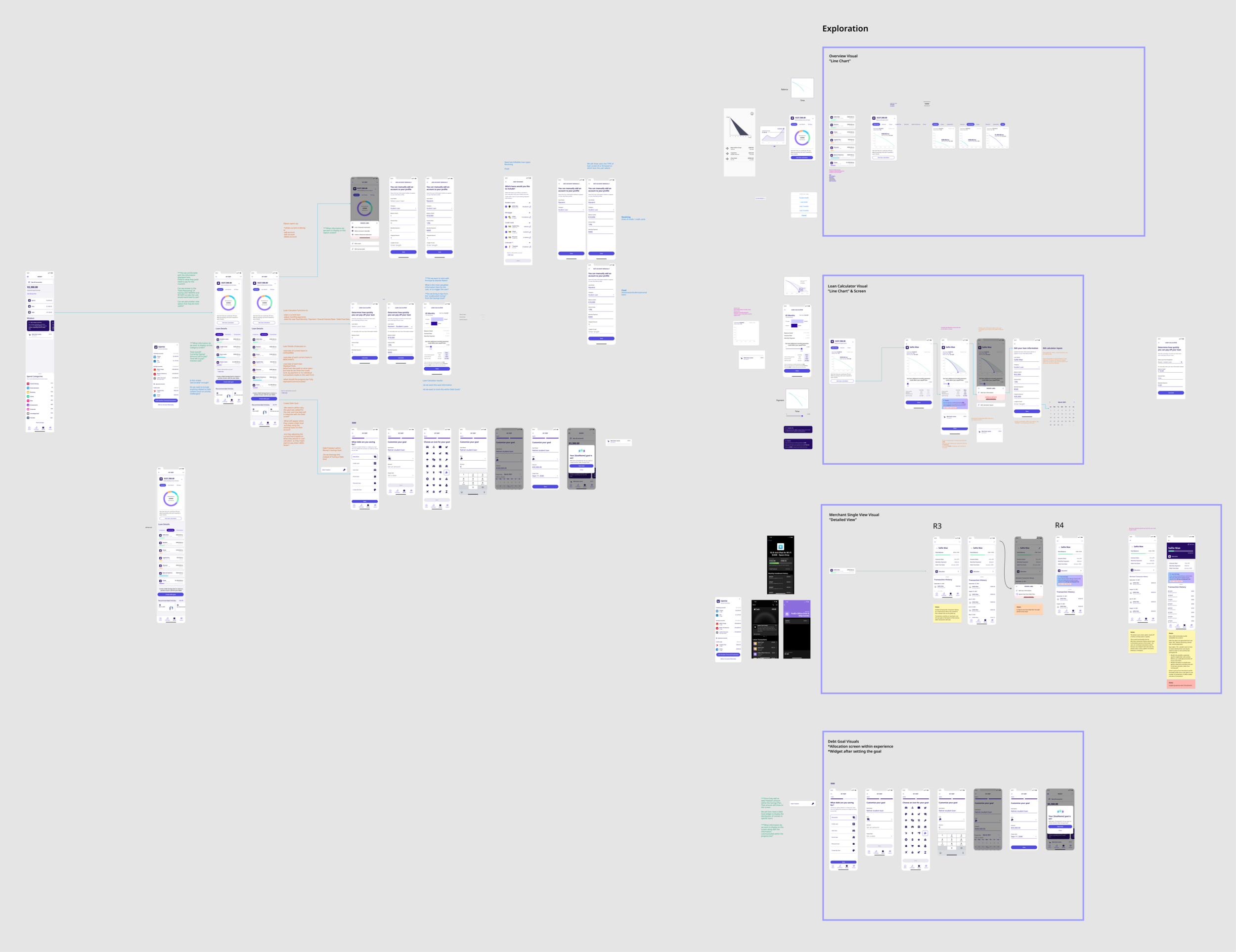
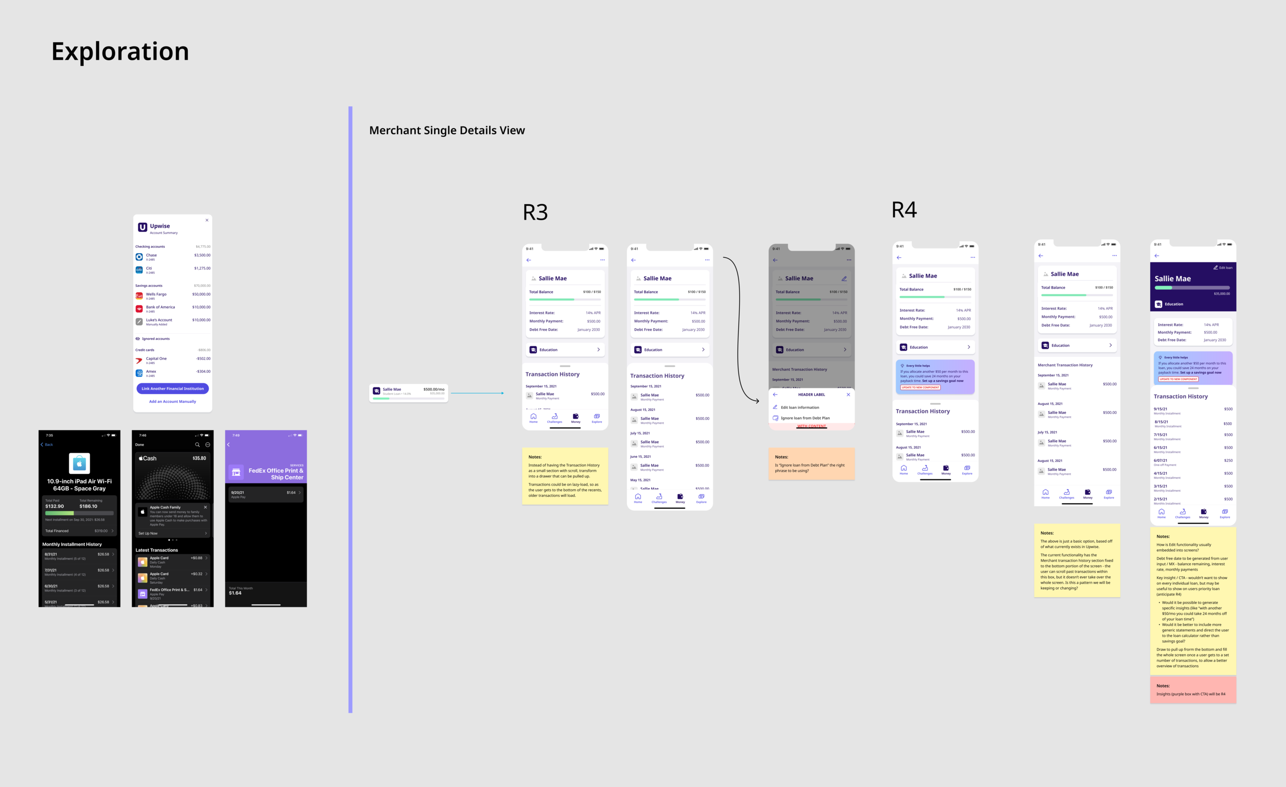
Exploring Single View Visuals
(Slide 4)
The Single view would be an overview for the user to go a little more in depth to the structure of their loan. The progression bar, along with their transaction history can showcase a pattern of how they are/aren’t handling their debt properly
Exploring Overview Visuals
(Slide 2)
This is where I first explored the “progression” aspect of Debt. Instead of a pie chart that would just display a “status” the line chart could display the progression of effort; signaling the user to make an action.
Exploring Debt Goals Visuals
(Slide 5)
This was still in the air. We weren’t sure if Debt needed to have this within the Debt Paydown Plan section, or ONLY live in Saving’s Goal (Debt Freedom) within the Money section. We left it as the same structure as in Money; only emphasizing what specific Debt they wanted to handle based on the ones’ linked.
Exploring Loan Calculator Visuals
(Slide 3)
The user would then “take action” to use the loan calculator. The would use the same line graph component as the overview, but it would highlight the decreasing payoff time when the user would increase their monthly payment; displaying the summary results within a “results'“ Wisdom card.
Version 3 “Tidy Up”
(Slide 6)
We wanted to present the full possible flow of the experience.
Client Response + Rethought 2
-
They loved the new approach! They felt that they could see the “experience” of using Debt Paydown to help the user be more actionable.
The client wanted to next see how our flow would merge with Money and how Debt accounts would be linked as well. -
We needed to make sure our latest approaches were:
- Continued conversations with the Money team as they were continually making changes so we could still maintain cohesiveness
- Feasible for the Dev team in their allotted Sprints
- My latest’s components were reviewed and added to the component library by the Design team -
We were happy with our approach. We felt the next steps presented were definitely the next “tie-in” pieces we needed; as we saw how important the Debt section could now be within this application. Our next steps were:
- Reviewing our latest Debt Pay down flow with Engineering team for feasibility
- Consider the client’s response for the “merging with Money”
- Taking our flow and user testing it to see how users would react to the Debt page and its experience
Debt Paydown Plan Version 4
(Slide 1)
This was it! We had our Debt Paydown Plan section! Well, sort of. At this stage there were a lot of nuances within the structured flow that we kept meeting with the teams about. We also used this time to start user testing the flow and each section.
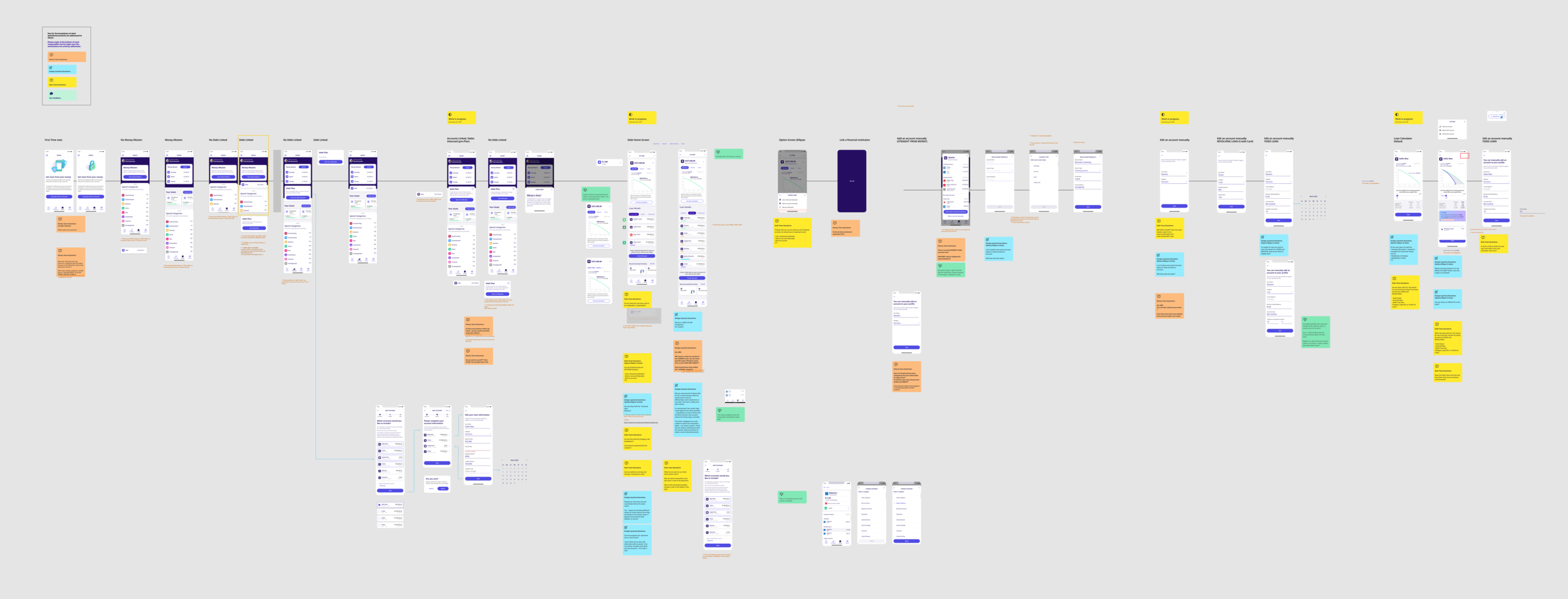
Cross-Squad Dependency Questions
(Slide 2)
This was my favorite portion of the project. I created a file of the full experience and set up meeting with each squad to analyze each screen to make sure:
Money Team - Did we integrate the right screens/components from Money?
Component Library Design Team - Have we used the components and new adhoc components in the best viable way?
Debt Team - Are we answering the full ask and requirements from our clients with each screen displayed?
Perfect Interruption
During (and after) our “Depency Questions” meetings we (Debt team) would discuss the structure of the Debt Paydown Plan and wondered if we were fully helping the users. We asked ourselves, “Have we gotten so involved and passionate about the project that we lose sight of how the user would fully understand our structure and its behavior?” (ie. the Overview visuals and the Loan Calculator connection). As we were also working on some Debt Challenges and User testing, we thought about these questions. This helped us align to a better question:
with all that is going on with this application (being an abundance of information) are we being “too passive” in our approach? Should we be more guiding and directional with the Debt section; knowing most users who want to pay off debt probably need more additives than just information on their noted debts.
-
The application has a section called Challenges; in which users can take on actionable challenges to help with there finances and knowledge of them; whether via articles, tasks, or personal contract agreements.
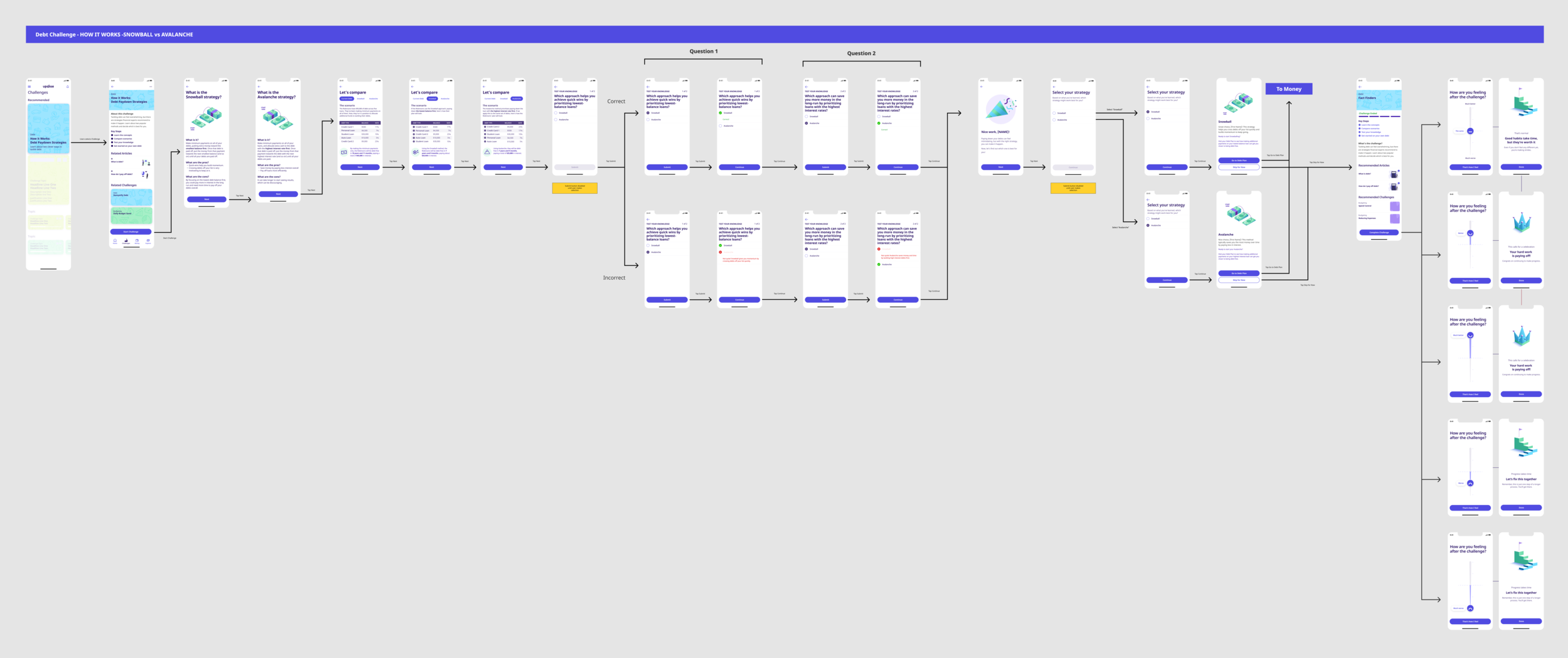
We were asked to create two Challenges for Debt: Emergency Funds and Pay Down Strategies. -
The Snowball vs Avalanche Challenge was showcasing two strategies people use to pay off debt:
Snowball : Snowball prioritizes your smallest loan first. Once it’s paid off, that payment amount is added to your next smallest loan, and so on.
Avalanche : Avalanche prioritizes your loan with the highest interest rate. Once it’s paid off, that amount goes to the loan with the next highest rate, and so on.
We were presenting these two strategies to teach them a specific practice to tackle their debt; also while directing them to suggest the Snowball strategy as the best approach for them to start. This prompted another question to the Debt team about being “direct” with the way we provide information to the user about their debts. -
We took each section a user test to make sure the user understood what the overview visual was communicating, the loan details, and the loan calculator purposes.
We also asked each user if they had ever heard of Snowball or Avalanche. Most said they heard of Snowball but didn’t know the full details of the strategy.
We took a more “directive” approach. We took the Debt Challenge (Snowball vs Avalanche strategy) and embedded it within our Debt Paydown Plan flow. To make sure the user was aware of how they would approach their debt, we added an onboarding flow within the experience to educate the user about pay down strategies; then forshadowing to the end of the onboarding experience to select one. This strategy was then used as the core structure of their Debt Paydown Plan. So if they selected Snowball as their strategy, we would visually showcase their current debt to focus on and how that strategy will already decrease their pay down period. We would also give them direct guidance on how to pay the loan based on the strategy, information on the strategy, and how the strategy affects their actual accounts.
Conclusion
I felt we did a great job on this project. With the complexity of the ask, along with the allotted time, we took the appropriate steps to figure the best user experience for the users. We concluded that we wanted the experience to be more “progressive and direct”; helping the user to be guided in a more structured way.
Though the Debt Paydown Plan was to be developed in its upcoming release, the client had to sit it in the backlog; as the Money section had more updates added to it. Since Money was the main focus, they wanted to make sure by the next release that had it solidified since it was already in production.
I learned so much on this project that I will take with me for projects to come. This was my first time being able to effectively work with designers majority of the project. We had productive cross-squad meetings, daily check-ins and Friday work sessions to bring up any blockers or items we were stuck on for added input. I had more design meetings than client meetings! (HUGE PLUS). In all, we came in to enhance a multitude of problems, we showed resilience and strife to reconfigure the component library, redesign each experience within the app in a more user-friendly way, and also add passion to a project that we were all too familiar with.
Kudos
“Hey @Rob Luke I wanted to reach out to let you know about the phenomenal work that @jorey.jones has done the last couple weeks. In the last week we were pressed to get designs out for an incredibly complex tool designed to help users get out of debt. There are a lot of complicated aspects to that in general, but we also had to make it work within an existing product. @jorey.jones worked incredibly hard to deliver high fidelity designs in a very short amount of time. He not only delivered the designs, but gave honest feedback, asked tough questions and pushed the team to make this a simpler user experience. I don’t want to think about where we would be without him. Thanks @jorey.jones for all your dedication and hard work!.”
— Jon P.
Product Strategist
Worked hand-in-hand to meet the specific deliverables required for integrating a Debt section into the application
“@Rob Luke I want to give a shout out to @jorey.jones. We have asked Jorey to adapt a lot over the last 3 months on [company]. Given the dynamic nature of the [company] Program, we have asked Jorey to adjust, or plan to adjust, his priorities several times. Throughout it all, he has been positive, productive, flexible and understanding. He has continued to deliver top-notch output, and been a flexible team player along the way. The team and the client are in a better place b/c of Jorey's contributions.”
— David T.
Delivery Manager
Made sure the team had all tools, time and information for the success of the project


